by JAKE DON

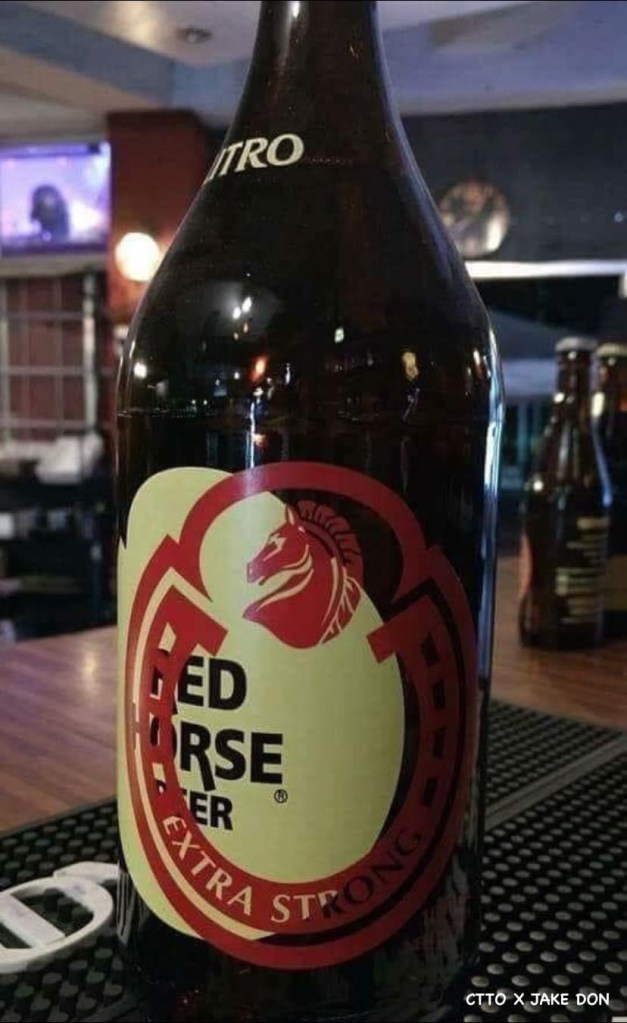
In a bold move that combines transparency with a hint of self-sabotage chic, San Miguel Corporation has announced a groundbreaking product warning on its Red Horse beer bottles.
Starting December 1, patrons will find the iconic Red Horse logo deliberately skewed, serving as an avant-garde cautionary tale for those with a penchant for the potent brew. In a surprising twist, the misaligned logo isn’t a design flaw but a deliberate move by the company to warn consumers of potential consequences.
This quirky marketing strategy mirrors the tobacco industry’s graphic health warnings, but with a twist – instead of ghastly images of damaged lungs, patrons are treated to the sight of a tipsy horse struggling to find its balance.
San Miguel Corporation claims it’s a bold step towards truth in advertising, embracing the mantra that “seeing is believing” when it comes to potential visual impairment.
Critics argue this might just be a clever ploy to attract hipster beer enthusiasts seeking the latest in ironic imbibing experiences. Either way, it’s a refreshing departure from the usual corporate smoke and mirrors. Cheers to truth, however distorted it may be!
